Mova King!

MOVA Home App needs cleaned too!

I think the MOVA Home app is the best on the market. But a few screens feel like they've been forgotten about📱

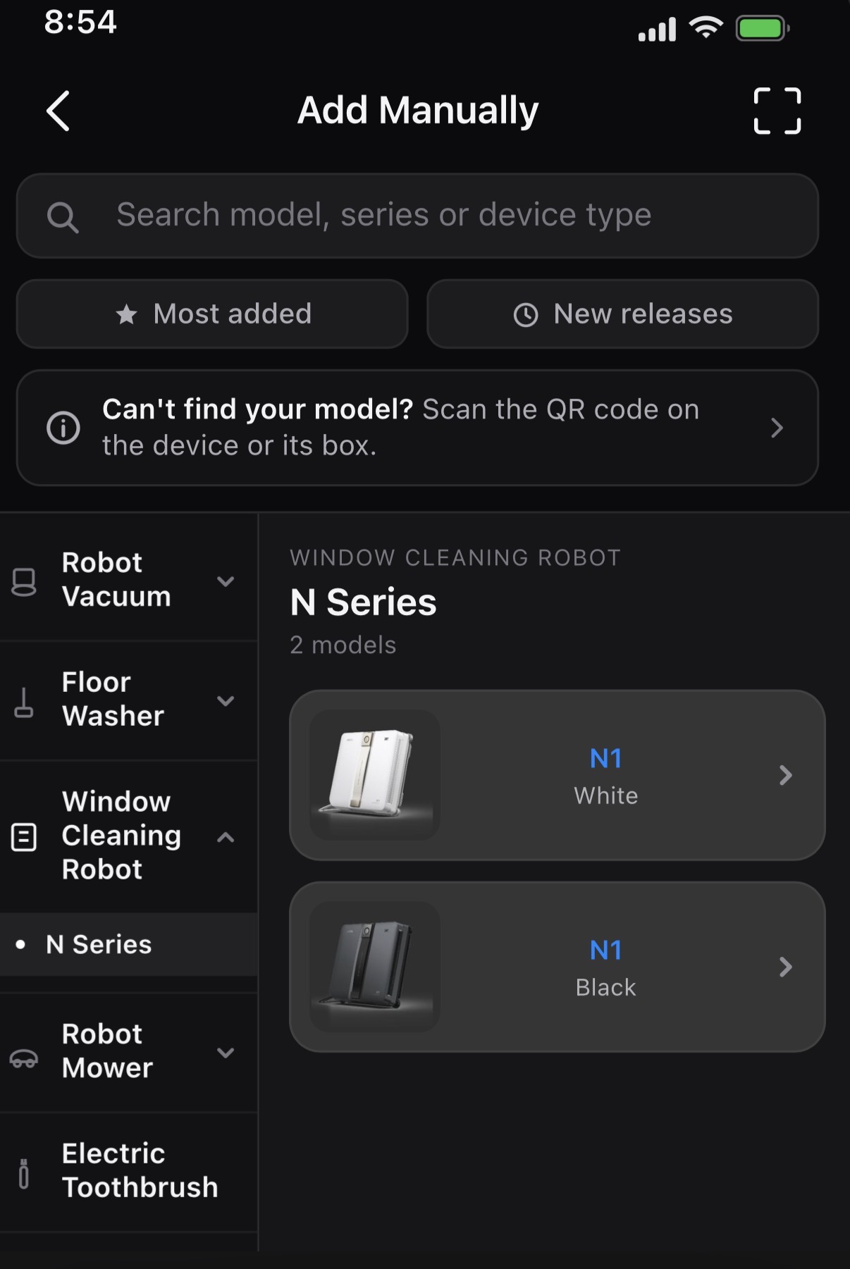
One of those screens is the "Add Manually" screen, where you pick your device from the catalog. It isn't the most important screen in the app, but it's the first thing you see when you set up a new product, and it's getting harder to use as MOVA adds more models. Here's what I changed and why.

🗃️ Better categories. Right now the mower models sit under a category named after one of its own sub series. I split them out into a clearer Robot Mower category.

🔎 Search. Scrolling a catalog this long to find one model is rough. Let me type it!

📥 A couple of filters. "Most added" and "New releases" would get most people to their device in one tap. It would also be nice to see what has been added recently at a glance or what other users are purchasing more of!

🖍️ Variant labels. There are two products both called Z70 Ultra Roller Complete and no way to tell them apart. Even the full text gets cut off! A one word variant label fixes it. Longer term, I'd move variant selection, especially color choice, to another screen so this one stays clean as the catalog grows.

🏬 While not present in this mockup, I could also see a connection of this screen to the Mall. If you're already browsing products here, a direct link to buy would make sense. I think the Mall tab is underutilized right now. I catch myself going to the MOVA store through a search engine instead of through the app.

What improvements would you all like to see in the MOVA Home app? 💬
Translate

No comments yet,

Grab the first review

You need to log in to reply. Login | Register
UID:JV943610 US
  • 282Posts
  • 5Friends

© 2026 MOVA Forum All Rights Reserved | Support by Discuz! X5.0 Font by MiSans

Quick Reply Back to Top Return to List